You know that link you share with a little mental caveat attached — "it's still a work in progress" or "ignore the header, I'm redoing that." Maybe you don't say it out loud. But you're thinking it every time someone asks for your small business website.
That's not just a design problem. That's a business problem that happens to live on the internet.
Most small business owners don't have broken websites. They have a site that worked fine for a previous version of their business — and then quietly stopped working somewhere along the way. The site still loads. The contact form still submits. But it isn't doing much else. Visitors land, look around, and leave without converting. A prospect checks the link after a great referral and what they find doesn't match the quality of the conversation you just had.
Your website is your first impression, your most consistent sales tool, and your digital home. When it stops working as those things, you feel it — even if you can't always name exactly why. Here are the five signs your site might be overdue for a redesign.
Sign 1: It Takes More Than 3 Seconds to Load
Visitors don't wait. As page load time increases from 1 to 10 seconds, the probability of a mobile visitor bouncing increases by 123% (Think with Google, Google/SOASTA Research, 2017). Even the jump from 1 second to 3 seconds pushes bounce probability up by 32%. Your visitors are gone before they've had a chance to read a single line about your business.
Speed isn't just a user experience issue — it's a search ranking signal too. Google officially confirmed that Core Web Vitals — including Largest Contentful Paint (how quickly the main content loads) — are part of its page experience ranking criteria. A slow site gets penalized twice: once by the visitor who leaves, and again by the algorithm that stops sending them.
The connection between speed and conversions is striking. A site that loads in 1 second converts at a rate 3x higher than a site that loads in 5 seconds (Portent, 2022, based on 100M+ page views across 27,000 landing pages). That's not a minor performance difference — that's the gap between a site that generates business and one that quietly lets it slip through.
If you're on a shared hosting plan or a DIY builder with bloated code under the hood, speed is often the first casualty. And it's one of the hardest things to fix from inside a template structure.
See how custom-built sites handle performance differently
Sign 2: Your Site Was Built for Desktop — Not for the Majority of Your Visitors

Mobile devices now account for 52.48% of all global web traffic, compared to 47.52% for desktop (StatCounter GlobalStats, February 2026). More than half your visitors are arriving on a phone. If your site wasn't built with mobile as the primary experience — not a scaled-down version of the desktop layout — you're starting every visit from behind.
Mobile bounce rates run roughly 10 percentage points higher than desktop, sitting around 58–60% versus 48–50% on desktop (Claspo, 2025). Think about what that means on a practical level: more than half the people who find you on a phone leave before they've had a real chance to engage. That's before they've seen your services, your work, or your pricing.
What does a mobile-unfriendly site actually look like? Pinching and zooming to read text. Buttons too small to tap reliably. Images that bleed off the screen. Navigation that collapses into something unusable. A contact form that requires desktop-style precision to submit. You might not notice any of this from your computer — but your visitors notice the second they land.
The DIY builder promise of "mobile responsive" doesn't always hold up in real use, either. Responsive templates adjust to fit the screen width. They don't account for how people actually use their phones — shorter attention spans, thumb navigation, zero patience for anything that feels off. A site built mobile-first performs differently than one adjusted to fit after the fact.
Sign 3: Visitors Land and Have No Idea What to Do Next
88% of online consumers won't return to a site after a bad user experience (widely reported industry benchmark, Google/Decibel Insight, 2012–2014). And the most common cause isn't a broken page — it's a site that doesn't make the next step obvious. A confused visitor doesn't dig around looking for clarity. They close the tab.
Here's a diagnostic worth running right now: what do you want someone to do when they land on your homepage? If you can't answer that in one sentence — or if a stranger landing there for the first time couldn't tell — there's a structural problem that no visual refresh will fix.
Poor information architecture and missing calls to action are the most common silent killers of small business websites. That first visit is often the only visit — and clarity isn't something visitors should have to work for.
What does this look like in practice? A navigation menu with seven or eight items, all weighted equally. No clear primary action — should I book? email? buy? browse? A services page that lists everything you offer without pointing anywhere. A homepage that gives an overview of your whole business without moving the right visitor one step forward.
The structural fix is less complicated than people expect. Every page should have one primary action. Every section should earn the scroll. The visitor should always know where they are, where they can go, and what they'll get when they take the next step. That clarity is a design problem — but the design can't solve it until the strategy behind it is clear.
Understand how site structure drives conversions
Sign 4: The Design Doesn't Match the Quality of Your Work
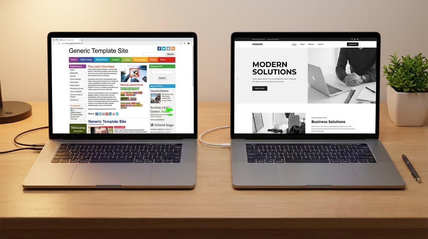
Visitors form a first impression of your website in approximately 50 milliseconds — that's 0.05 seconds — and 94% of those first impressions are design-related (Lindgaard et al., Northumbria University, published in Behaviour & Information Technology, 2006). Before your visitor reads a single word, they've already formed a judgment about whether what they're looking at feels credible. That judgment happens almost entirely on aesthetics.
Research from the Stanford Web Credibility Project found that when evaluating the credibility of a website, design-related factors account for nearly 75% of all judgments. Specifically, 46.1% of respondents cited "look and feel" as the primary credibility driver, and another 28.5% cited information design and structure (Stanford Web Credibility Project, n=2,684 participants). Content, references, and company details made up the remaining 25%.
What does this mean for you? If your site looks like a template — because it is a template — visitors pick that up. They may not say "this is a Squarespace site" out loud. But they feel something: generic, familiar, slightly misaligned. When the quality of your actual work is higher than the quality of your website, there's a gap. And gaps create doubt before you've had a chance to say anything.
Your website shouldn't just represent your business. It should feel like your business. That shift — from a site that has your logo on it to a site that genuinely feels like you — is what changes how confidently you send people there.
See what a brand-aligned custom site looks like
Sign 5: You're Embarrassed to Share the Link
According to industry data, 67% of businesses have reported lost revenue directly tied to poor website performance (Liquid Web Website Performance Study, 2024). But the version of that cost that hits hardest for small business owners isn't measured in analytics. It's the referral you almost made, then quietly didn't. The prospect who visited for 12 seconds and moved on without reaching out.
This is the sign that doesn't show up in any dashboard. No bounce rate chart captures the moment you hesitated before sharing your URL at a networking event. No heatmap records the client who visited after a great conversation and decided your site didn't match the quality of it.
Here's something worth sitting with: your current website was built by a past version of you, for a past version of your business. If your offerings have matured, your prices have moved, your clientele has shifted, or your brand identity has evolved — but your website hasn't — that gap is doing quiet damage. Every time you send someone to a site that undersells your work, you're asking them to fill in the blanks themselves. Some will. Most won't.
What These Signs Mean Together
Any one of these signs is worth taking seriously. Together, they describe a website that has quietly become a liability — not broken, just no longer working in your favor.
In most client audits, two or three of these signs show up together — rarely just one in isolation. A slow site that's also hard to use on mobile, with a design that no longer fits the brand, is a compounding problem. Each sign quietly makes the others worse.
| <strong>Sign</strong> | <strong>Business Impact</strong> | <strong>Likely Fix</strong> |
|---|---|---|
| Slow load time | Higher bounce rates, lower conversions, search ranking penalty | Performance audit + optimized hosting or custom build |
| Mobile-unfriendly | 50%+ of visitors have a poor experience before seeing your offer | Mobile-first redesign |
| Unclear navigation | Motivated visitors leave without converting | UX restructure + clear primary CTA per page |
| Design-credibility gap | Prospects doubt your quality before speaking with you | Brand-aligned custom design |
| Embarrassed to share | You're suppressing your own referrals and outreach | Full website reassessment |
Speed issues send visitors to competitors before you've had a chance to say hello. Mobile problems push away the majority of your audience before they've seen anything. Unclear navigation stops motivated visitors from becoming actual inquiries. Design that doesn't match your quality creates doubt before a conversation can begin. And if you're embarrassed to share the link, you're manually suppressing your own reach every time you hesitate.
The move from "site that exists" to "site that works" is a strategy shift. Well-executed website redesigns improve conversion rates by 20–200%, depending on how far the original site had fallen behind — with named case studies showing bounce rates drop 10–40% post-redesign, especially on mobile (VWO, 2024). That range is wide because the gap varies. The direction is consistent.
If you're seeing more than one sign here, you already know the next step. The question is just when.
Frequently Asked Questions
How do I know if my website is actually hurting my business?
The clearest signals are behavioral: high bounce rates, low time on page, few inquiries relative to the traffic you're getting, and visitors who reach your contact page but don't submit. If you also hesitate before sharing your link, that instinct is usually accurate. A site doesn't need to be broken to stop working for you.
Can I just update my current template instead of rebuilding?
Sometimes, yes. If the structure is sound and the design is close, a refresh can extend the life of a template site. But templates have hard limits — layout, functionality, and performance are baked into the platform. If you need meaningfully better speed, a design that genuinely reflects your brand, or custom features that work the way your business works, a refresh won't get you there. Understand the tradeoffs
How long does it take to see results after a redesign?
Conversion-related improvements — bounce rate, time on page, inquiry volume — can show up within weeks of launch. Search ranking changes take longer, typically three to six months, as Google re-crawls and re-evaluates the updated site. Setting up proper analytics tracking before launch means you can actually measure the difference.
What if I can't afford a full custom rebuild right now?
Starting smaller is still a real option. If a full custom rebuild is not the right move yet, focus first on clarifying your offer, tightening your messaging, and improving the highest-impact pages. Then invest in a custom build when your site needs to do more for the business.
Will rebuilding my site hurt my current search rankings?
Done well, no — and it often helps. Migrating to a faster, better-structured, mobile-optimized site with proper redirects typically improves search performance over time. The risk lives in poorly managed migrations: broken links, missing redirects, dropped structured data. A professional build includes redirect mapping and SEO preservation as part of the process, not an afterthought.
The Bottom Line
Your website is the one piece of your business that's working — or not working — around the clock. It either moves visitors forward or sends them away. Most of the time, a site that's holding a business back isn't dramatic about it. It just quietly underperforms: a few seconds too slow, slightly awkward on a phone, navigation that leads nowhere clear, a design that doesn't quite feel like you.
Those quiet problems compound. And the fix is less complicated than most business owners expect once they decide it's time.
If you recognized your site in any of these five signs, the honest next question isn't whether to fix it. It's when, and who to work with.
Tiffany Durham is an AI web developer and the founder of Fidelis Virtual, a boutique web studio building custom, AI-powered websites and web apps for small business owners.
Build it right the first time.